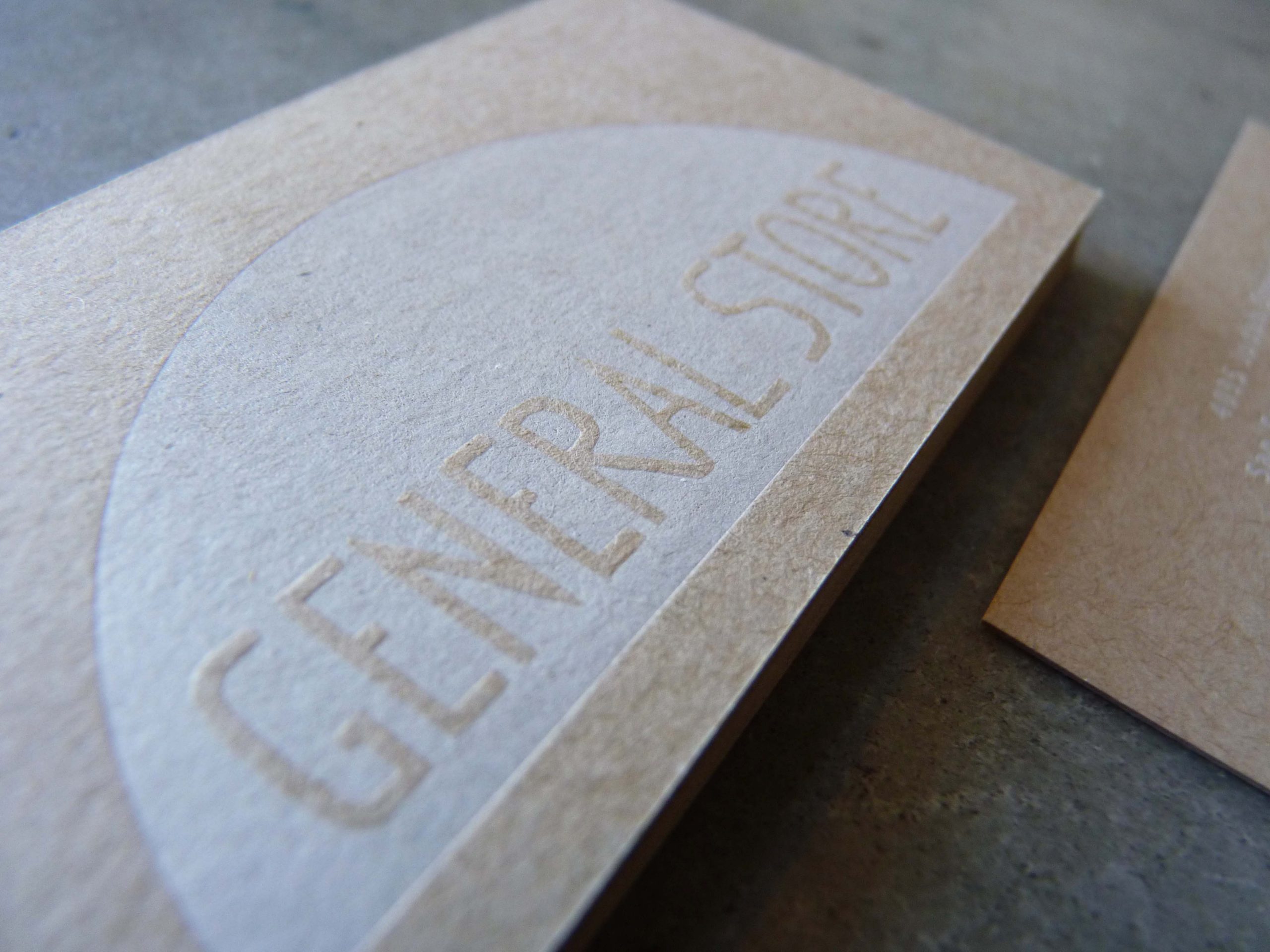
Some years ago, we printed business cards for the iconic California shop, General Store.

General Store has an earthy, yet airy, beachy, yet woodsy aesthetic. For these cards, we used recycled “kraft” chipboard as the paper.

As a counterpoint to the rougher, more rustic paper stock, we used white letterpress ink to print with. White letterpress ink is fairly transparent, so many clients choose to utilize white foil instead, which is much more opaque and creates a stark contrast. However, here the transparency of the ink really contributed to the aesthetic of the cards.

With any level of transparency in the ink, legibility can be a concern, but on the recycled chipboard, the opaque white contrasted enough to be legible.
If you are in need of unique business cards whose physical presence contribute to your brand identity, don’t hesitate to get in touch.
